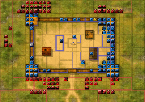
Since character classes are now quite important in fortbattles, we decided to display the classes in the overview. We had to sacrifice the small person picture for getting some more details, and the symbols are fairly primitive to simplify identification. We played a bit with coloring the lifebars and other things, but it turned out to be quite chaotic. So this is what we came up with:
20 Comments
Comments are closed.


sweet, but i count 5 symbols? whats up with that?
I assume this is the greenhorn?
K.I.A 😉
there 4 character classes + the greenhorn. makes 5 classes, that can access a fort battle, so you need 5 icons, that’s my consideration.
+ = greenhorn
\ = dueller
X = Soldier
o = adventurer
[] = worker
What’s the greenhorn?
I think the detailed version (in earlier versions) is much better… This is just toooo caotic…
Chaotic – yes. But the information about the character classes is important. It also matters how close you look at it.
Hi zet,
nice idea :), but what about the “green led” on the right corner for on-line players?
Hi Zet,
It would be great if you will add button for this function like shadow off/on
How you look at it?
Why are some symbols rounded and some aquare?
@colosseo: the green dot is still there – it’s just that my bots don’t log on
@macabre: Nice idea, but would take some more time and we have a huge pile of things to do still….
@Aaron: Freelancers have round symbols. Been always like that. Freelancers are the ones who can pick their sides.
nice idea, but still too chaotic…too much graphic detail for too little info transmitted. since there are 4 (+1) classes, i’d choose to represent them all with a single line in 4 different positions +1 clean figure for the greenhorn. that would look something like that:
(the paranthesis are for the contour..)
(\) =adventurer
(/) =dueler
(-) =worker
(|) =soldier
( ) =greenhorn
i think it looks a little bit clearer this way :)..
very bad
But It Would be great if You will add shadow like button for this function off / on
How about a different colored health bar, like green for example? Would be much easier to see that way.
@leones: I tried out colors first. It was really bad. I should have made a screenshot, but the chaos it introduced is far far worse than of these symbols. The problem is, that the most important information is, what team a player belongs to. If you add colors to the bars, it’s no longer possible to see at a quick glance where the sides are positioned. It’s a constant distraction when trying to figure out where the teams are situated.
@kasza: A button would be nice, I aggree, but it’ll need more work, and our timetable is already very full. I found the initial view also a bit uncomfortable, but it became better after a short while.
@umbra: The symbols do have some basic meaning, like the X of the soldier is like the symbol in the character menu. The worker’s rectangle is like the toolbox or a building block or a sector. The other symbols have less of a meaning, but I showed them to 2 people and they were able to guess their meanings just by looking at it without false guesses. If you use just straight lines, there’s no meaning involved any more and you can’t guess it any more.
You’re probably correct about those colors, it does limit the ability of a quick overview.
You’ve already tried it, and I haven’t, so you’ll probably know better than me.
I thought [+] was for Pope.
Anyway good idea for tactical players.
GF
Perhaps leave the picture of a person on your own character? You already know what class you are (I hope) and it looks much nicer. I do like the update though! 🙂